Sommerbob
The Sommerbob redesign involved a complete overhaul of the company’s website to create a more modern, user-friendly, and visually appealing platform. The goal was to showcase Sommerbob’s range of activities effectively and encourage visitors to explore and book their leisure experiences online. Key highlights include a revamped user experience, mobile optimization, integration of booking functionality, and improved visual appeal. Overall, the project successfully enhanced Sommerbob’s online presence and provided visitors with a seamless platform to discover and engage with their offerings.
Sommerbobbahn Erpfingen has been a successful family business for decades. The benefits of a website were recognised already in the early 2000s. However, the company’s website had not been updated since then. So not only was the site outdated by decades technically, but also communicatively; because even if its content never changed, the visitors’ habits did – and therefore also the way they would perceive the content.
The relaunch of the site clearly shows the nuances that must be taken into account. This relaunch was not about a radical new approach or a controversial new campaign. Quite the opposite, in fact. It was about staying as close to the spirit of the original as possible. Discovering small innovations along this narrow path, rethinking things and creating a presence that honours the past while still being committed to the future is perhaps a more difficult, but certainly more enriching task.
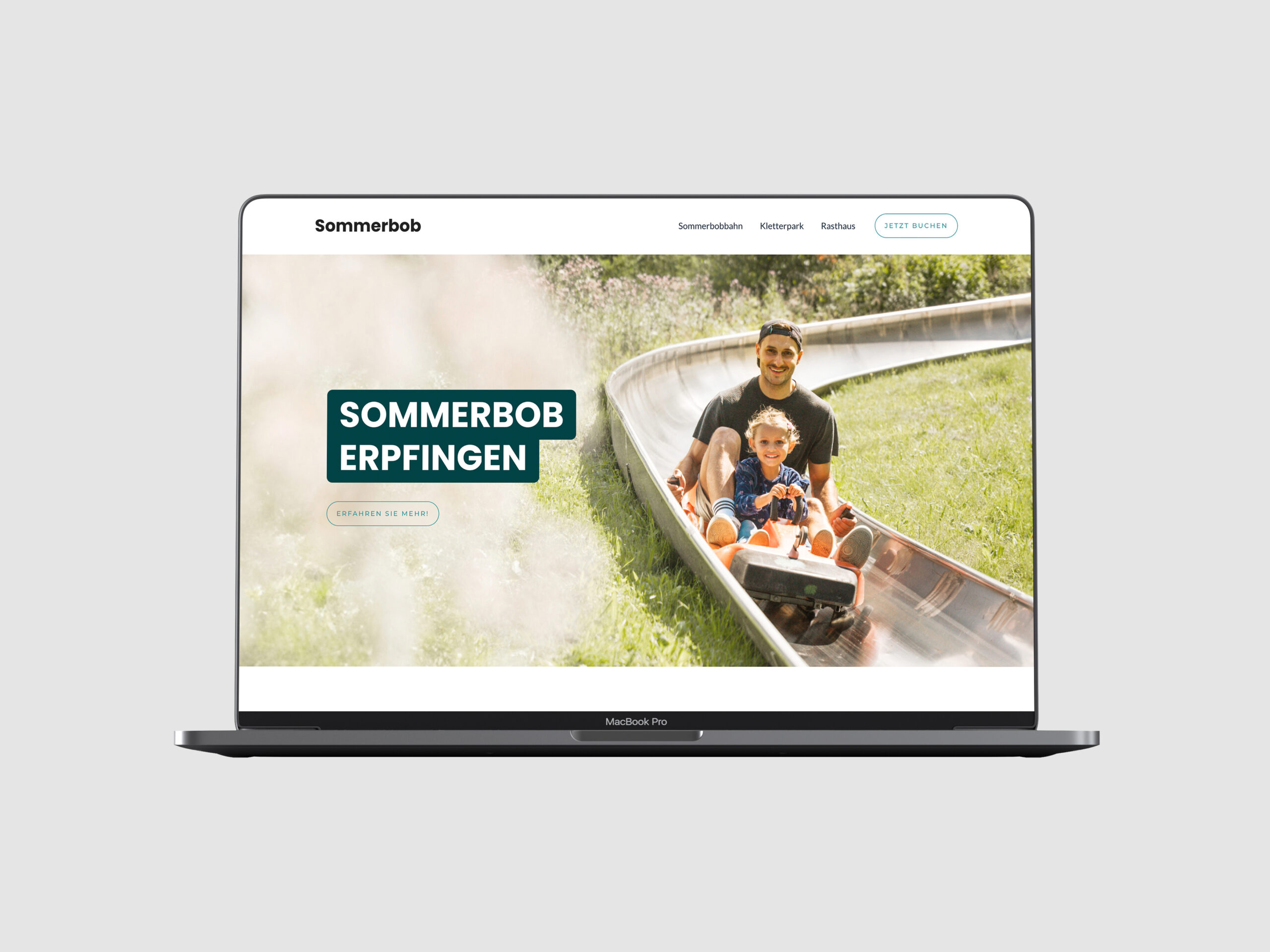
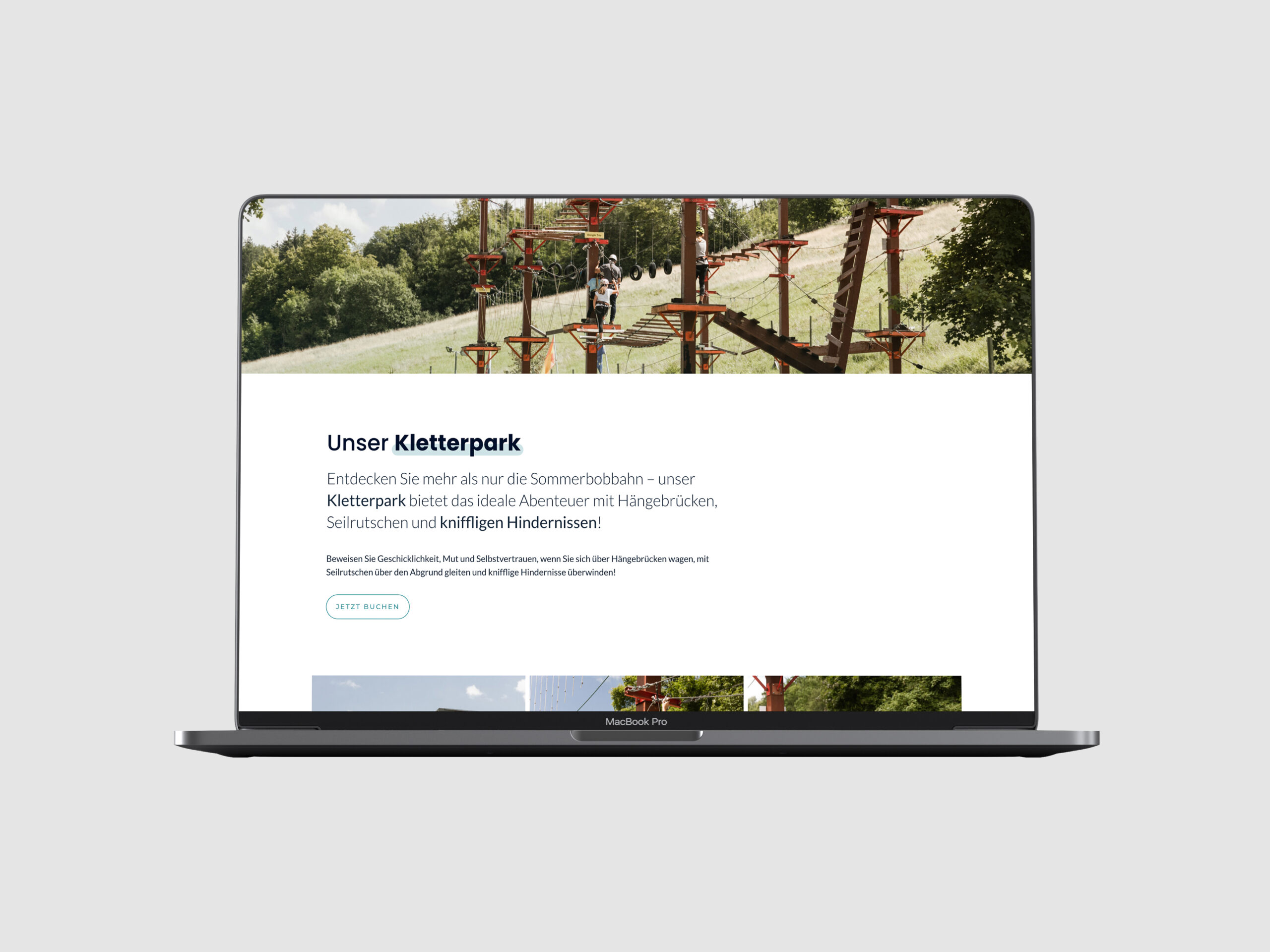
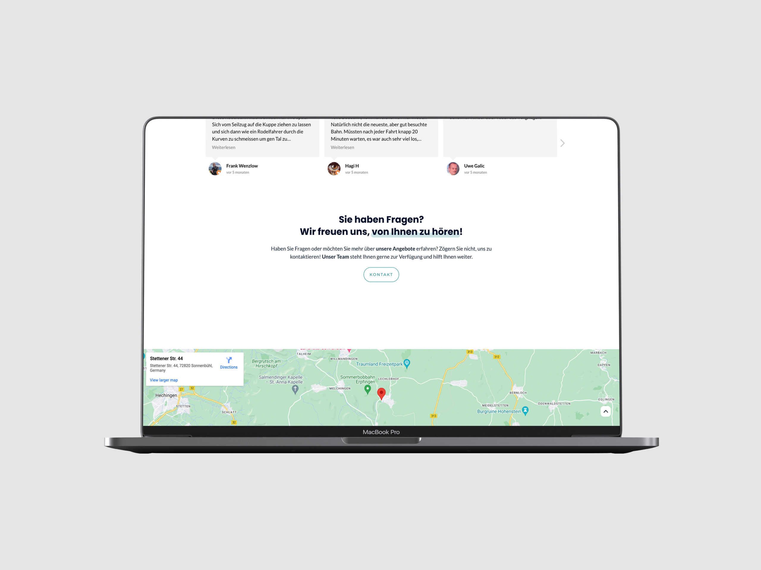
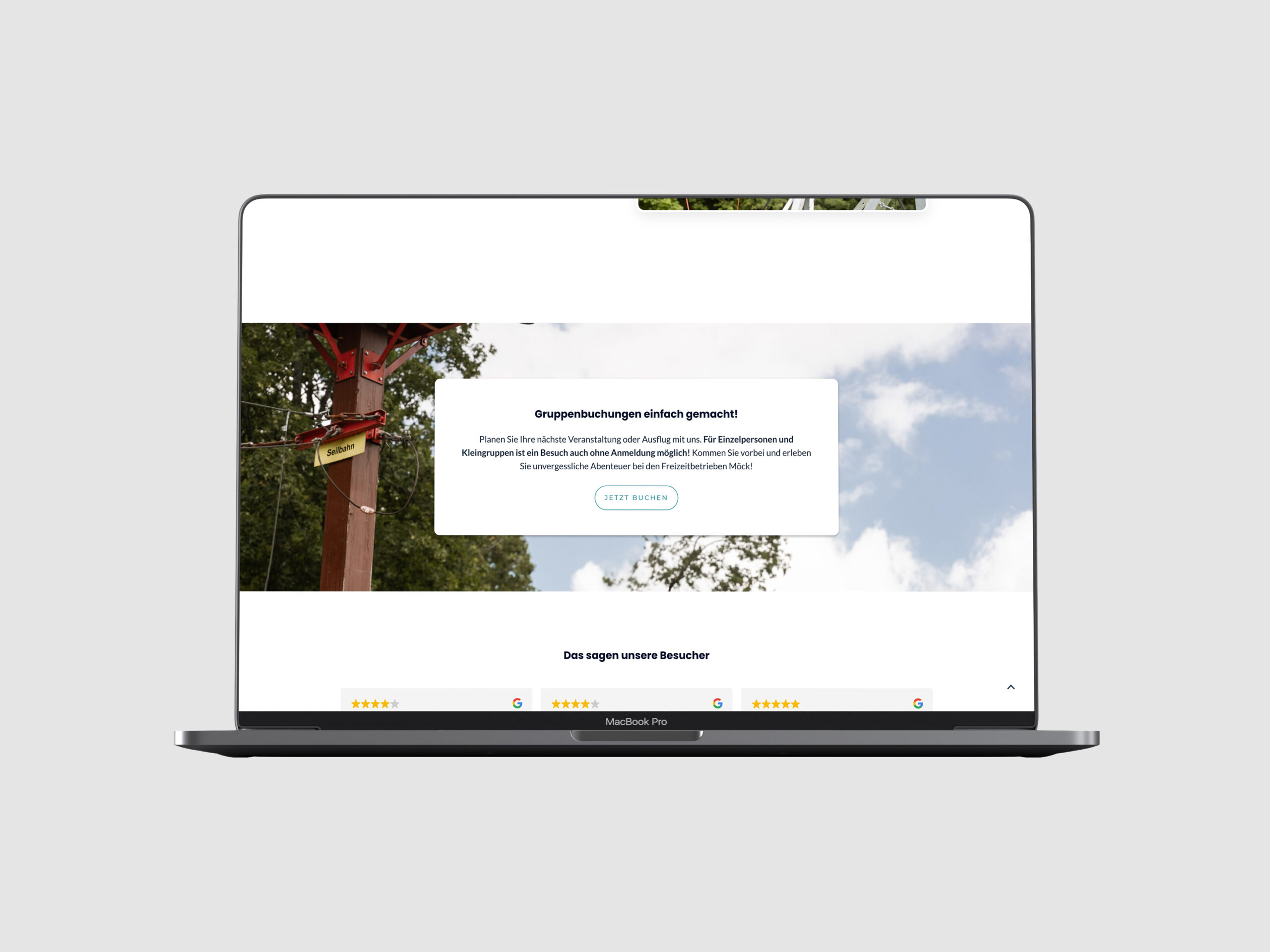
Website relaunch for the German leisure facilities Freizeitbetriebe Möck/Sommerbob Erpfingen
★★★★★ (5/5)
Michael created an extremely professional company website for us and helped us with a smooth change of provider during the season. The advice and support were excellent right from the start and remained so afterwards. We are very satisfied with the quality of the work and the commitment. (…) We can recommend it without reservation! → view on Google
— Jona Beierlein (translated)
